Apr 7, 2025
Case Study

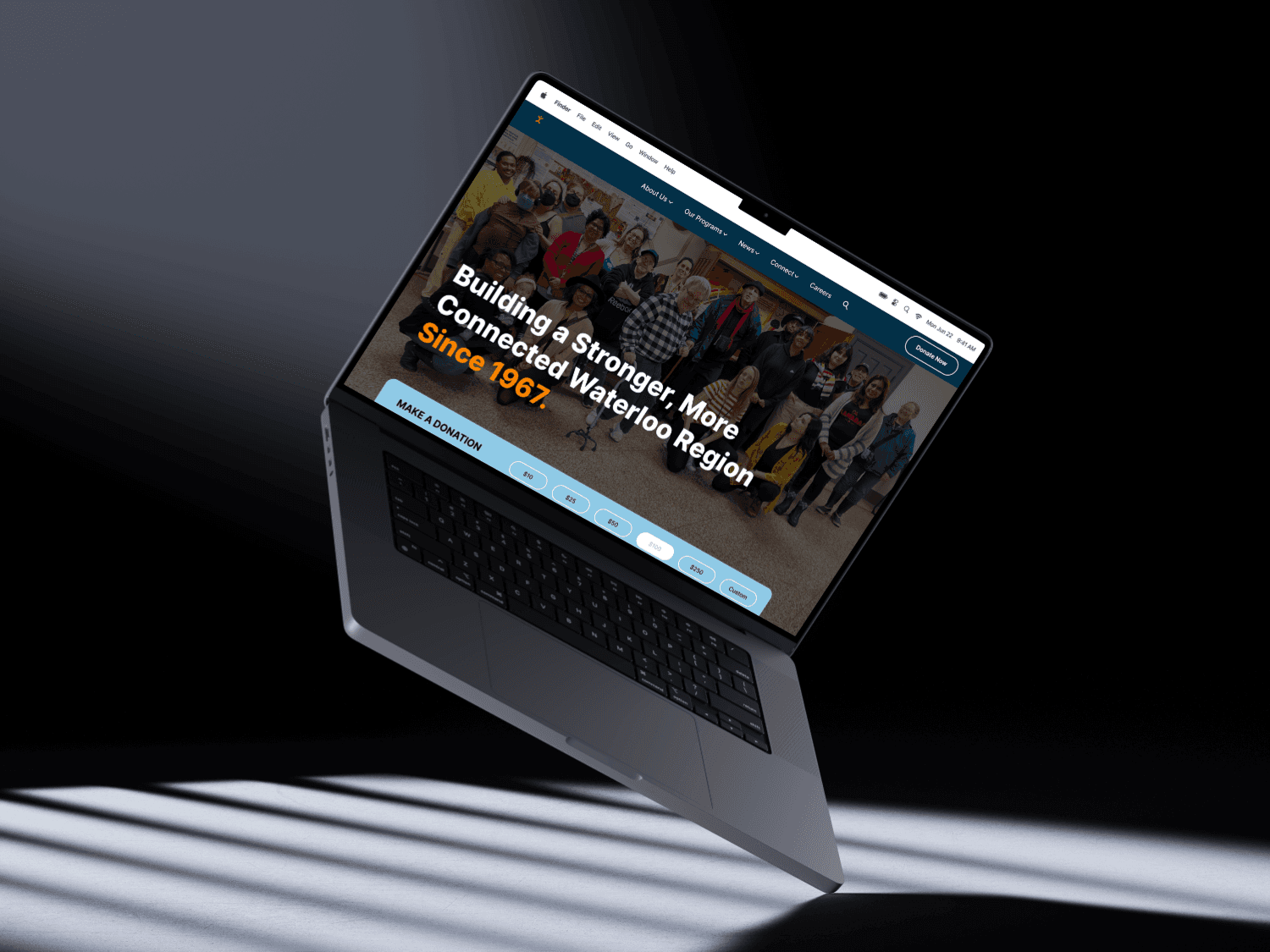
This research project took place over the course of the Winter 2025 semester as part of DAC 400: Digital Research Project at the University of Waterloo. Working in a team of three students, we were tasked with partnering with a local non-profit organization to help them rebrand their digital identity, including a logo, colour palette, typography, and a website prototype. We were to focus on storytelling and a user-centric design to highlight their impact and engage their target audience. After some research and talks with multiple non-profits in the Waterloo Region, we decided to work with the Social Development Centre Region of Waterloo. This partnership felt especially meaningful to me pe personally, as SDC is located just five minutes from where I live. Contributing to an organization rooted in my own community made the work feel both relevant and rewarding.
SDC’S EXISTING WEBSITE WAS DIFFICULT TO NAVIGATE, LACKED VISUAL COHERENCE, AND DID NOT COMMUNICATE A CLEAR OR COMPELLING BRAND IDENTITY. USERS OFTEN STRUGGLED TO FIND THE INFORMATION THEY NEEDED, RESULTING IN FRUSTRATION AND REDUCED ENGAGEMENT.
There is a clear need for a refreshed website that would not only enhance usability for current users but also strengthen the organization’s online presence and credibility within the community.
The initial research for this project began before selecting the non-profit we wanted to work with. We didn’t want to waste our time building this identity for an organization that didn’t necessarily need the help. So, we chose four non-profits that could use some help with their current digital identity, and then one that we saw was performing well. Then, using pro-similarweb.com, our own expertise, and focus groups, we performed a competitive analysis. Our categories and metrics were as follows:
Category | Metric 1 | Metric 2 | Metric 3 | Metric 4 |
Website Traffic and Engagement | Monthly Unique Visitors | Bounce Rate | Average Session Duration | Pages Per Session |
Content Quality and Relevance | Clarity of Mission and Goals | Frequency of Updates | Diversity of Media | Call-to-Action Effectiveness |
User Experience and Design | Ease of Navigation | Mobile Optimization | Page Load Speed | Accessibility |
Conversion Effectiveness | Donation Process | Volunteer Sign-up Flow | Email Capture Effectiveness | Event Registration |
Each metric was also given a rating out of 5 and then averaged out to give a total score out of four for each category. For more subjective metrics like “clarity of mission and goals” or “ease of navigation”, required some opinions outside of our group of three, so we created a focus group with our classmates and asked them to review some metrics to better inform our final rating, minimize bias and improve the reliability of our scores.
After calculating final ratings, we created two perceptual maps to visually compare the difference in performance between organizations.
 | 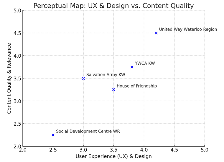 |
SDC performed the lowest in almost all categories. When we presented our findings to SDC’s executive director, she acknowledged the need for improvement and welcomed the opportunity to collaborate for the semester. While they had recently rebranded their logo and colours, we were invited to focus solely on the website. (We still explored a new logo for coursework purposes, but did not include it in the final prototype.)
To get things started, along with SDC, we recognized five core areas of improvement:
Navigation and UX
Organize the sidebar for better accessibility
Improve the navigation bar and make clearer categories
Consistency and Layout
Ensure a uniform design across all pages
Improve spacing, alignment, and section structure
Landing Page and Vision
Develop a stronger landing page that outlines their vision and values
Branding and Visual Appeal
Create a modern, rounded, and flowing aesthetic
Mobile Optimization
Design a mobile version of the website
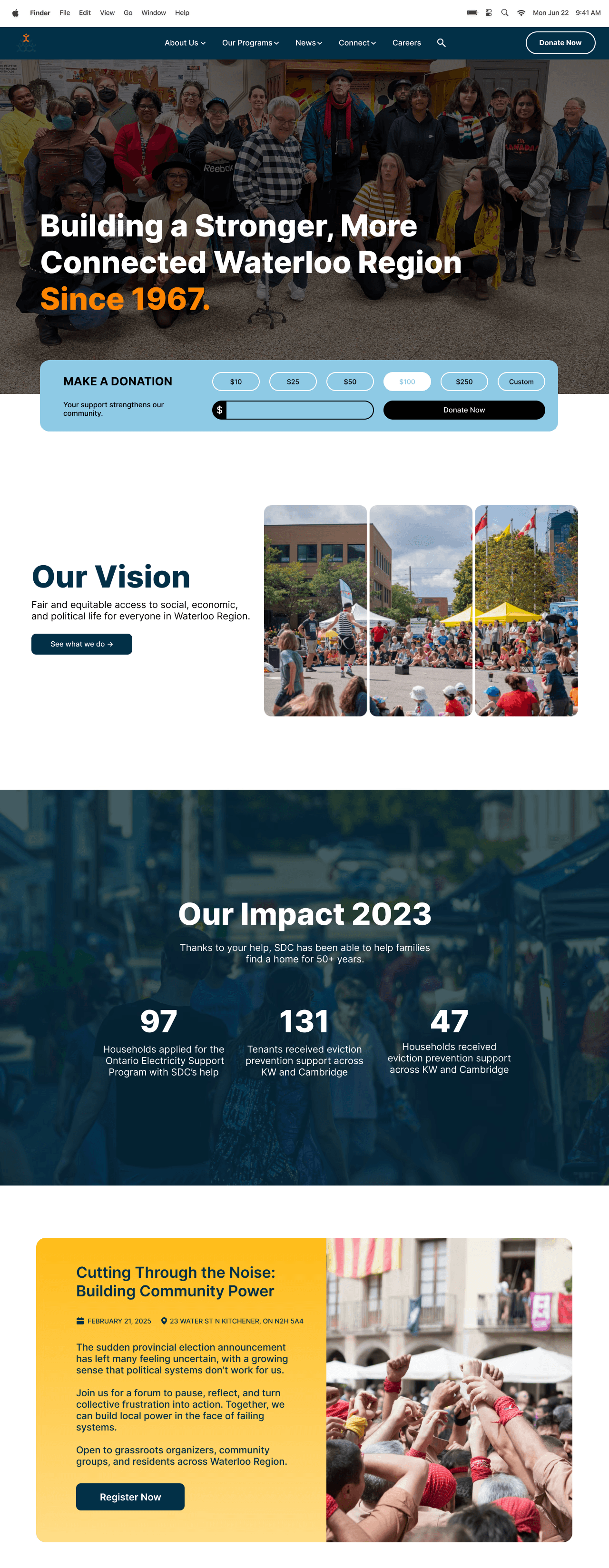
Before Redesign
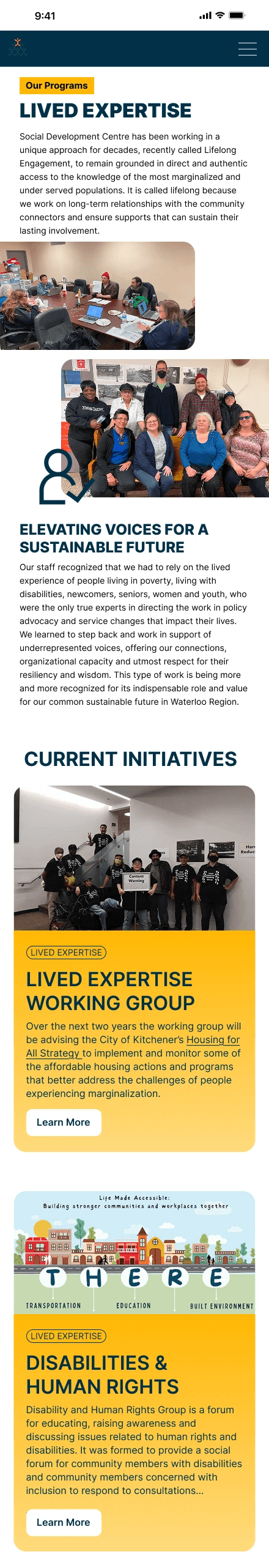
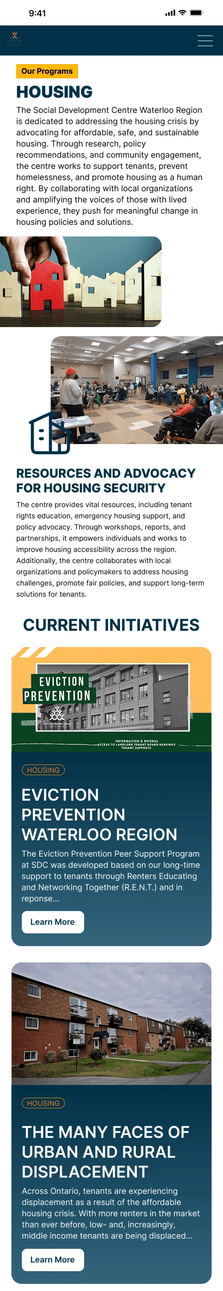
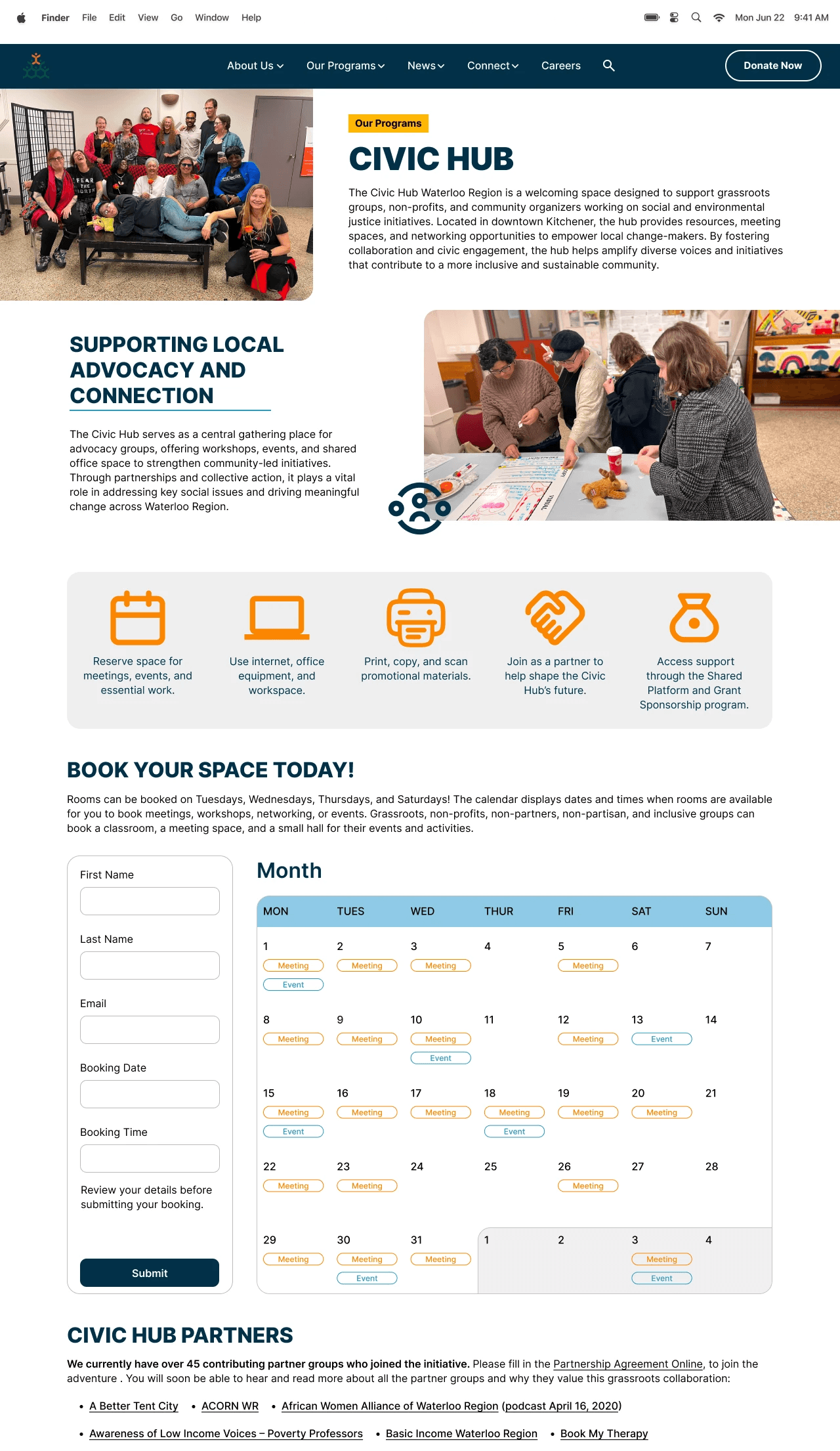
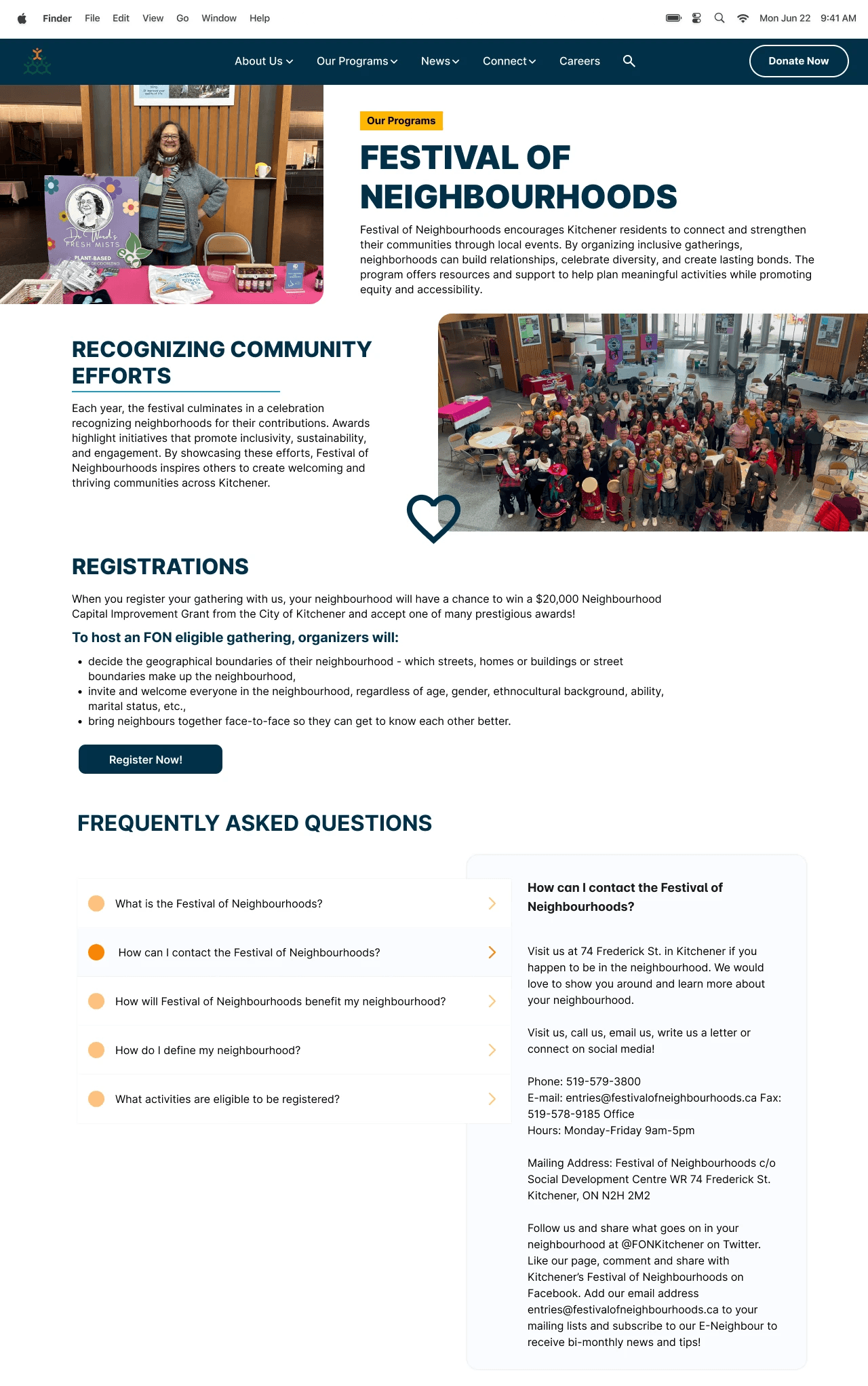
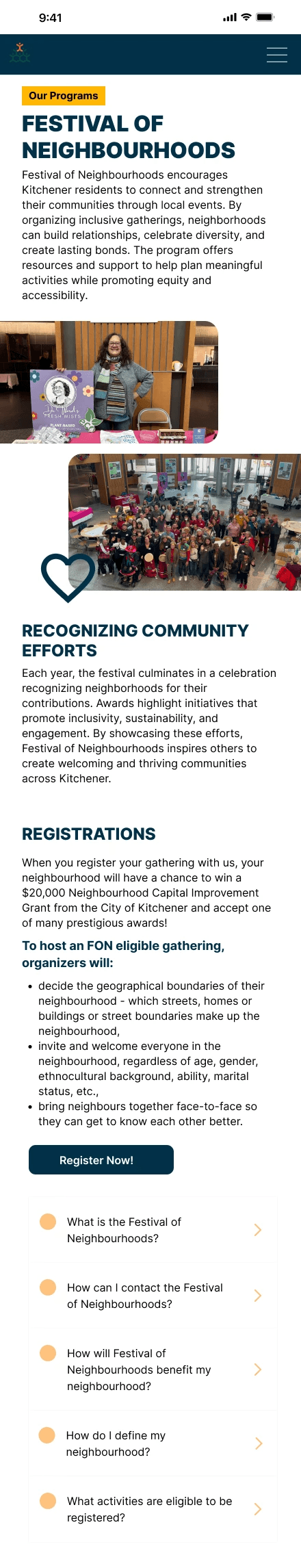
Our Figma prototype directly addressed the five core areas of improvement through a clean, modern layout and an intuitive navigation system. We reconstructed the navigation bar for clarity, applied a consistent visual style across all pages, and designed a new landing page that clearly communicates SDC’s mission, values, and impact. The prototype uses a colour palette very similar to SDC’s current identity but with some added touches. The typography we chose was Inter to improve readability and visual aesthetics. We also created mobile versions of each page to ensure a seamless experience.
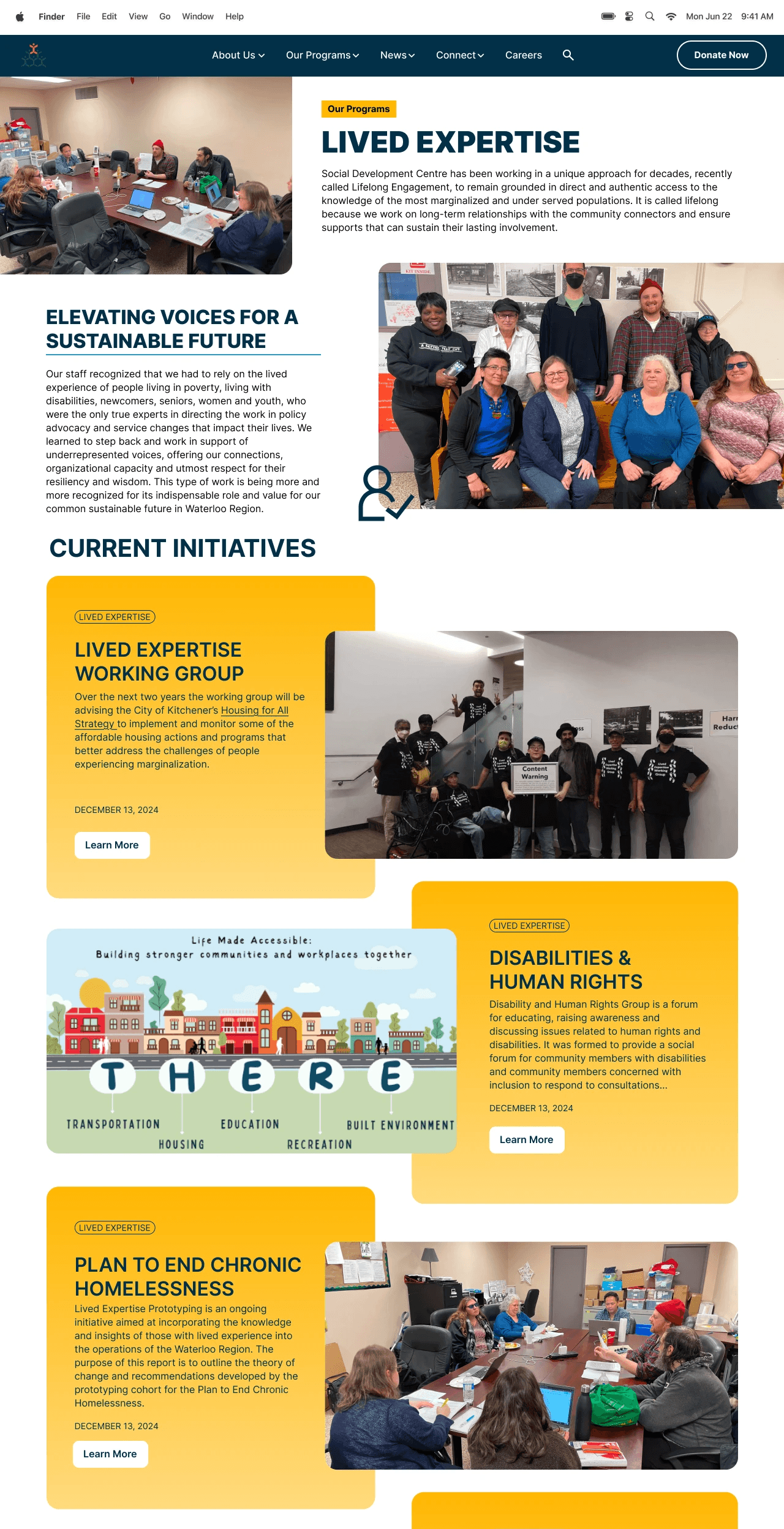
Figma Prototypes
My responsibilities for this project included improving the site’s navigation and redesigning the program pages to create a clearer, more user-friendly experience. Here’s what I created: